You can calculate the financial drain of inefficient software by using the specific range of 8 to 15 percent of operating expenses identified by Nexoris Technologies. This guide helps you trace hidden costs like high turnover and support tickets back to your design flaws.
Poor enterprise software design costs Nigerian organizations between 8 and 15 percent of their operating expenses.
Nexoris Technologies finds that these losses usually hide in high error rates, excessive support tickets, and increased staff turnover.
Leadership teams often miss the connection because these costs appear as separate line items across different departments.
Fixing design flaws early is significantly cheaper than addressing them after a system launch.
Nexoris Technologies provides a simple calculation to help businesses measure exactly how much money they lose to inefficient digital tools.
Bad UX in enterprise systems costs Nigerian and African organisations roughly 8 to 15 percent of operating costs in the business units that depend on the affected system, often without anyone connecting the loss back to system design.
Across the enterprise UX audits Nexoris Technologies has run for banks, manufacturers, e-commerce brands, and government clients in 2025 and 2026, the cost shows up in four predictable places: error rates, support ticket volume, training time, and employee turnover.
Globally, the figure is much larger. Poor digital experience is estimated to cost businesses around $1.4 trillion every year(Pendo, 2025).
This guide breaks down where that money actually goes, what bad UX has cost real companies you have heard of, how to calculate the cost in your own systems in naira, and the practical steps to fix it before the numbers get bigger.
Key Facts at a Glance
$1.4T lost globally to bad UX annually (Pendo, 2025)
$3.7T in revenue at risk from poor digital experiences (Transcenda, 2024)
Every $1 in UX returns up to $100 - 9,900% ROI (Forrester)
100× costlier to fix UX post-launch than in design (1-10-100 Rule)
20–40% fewer support tickets after a UX redesign (Atico³, 2026)
415% ROI, $7.6M NPV, payback under 6 months (UserTesting/Forrester, 2025)
Up to 30% higher IT costs from inefficient digital processes (IBM)
88% of users won't return after one bad experience (Baymard)
Up to 6% of revenue lost yearly to outdated digital experiences (IBM)
₦200M–₦600M+/year cost of bad UX in a 500-staff Nigerian enterprise
Why does bad UX cost so much in enterprise systems?
Bad UX costs more than people think because the time and errors it generates are invisible to the people running the business. Nobody files a report saying "I spent 14 minutes today fighting the dashboard." But when 500 people do that every day for a year, the bill lands in operating costs, support tickets, missed compliance deadlines, and quiet attrition, not on the design team's desk.
In consumer software, UX is judged on visual appeal and brand feel. In enterprise software, the standard is different. UX is measured by outcomes: how quickly employees complete tasks, how often errors occur, how much support is needed to keep the system running, and how long it takes a new hire to become productive. When internal tools are difficult to use, the impact is not frustration. It is money.
Most leadership teams do not see the connection because the numbers do not arrive labelled. Operations sees rising support costs. HR sees rising turnover in roles that depend on the system. Finance sees rising training spend. Compliance sees more incidents traced to data entry errors. Each function reports its own line item, and nobody traces all four back to the same root cause: a system that is hard to use.
What does bad UX look like when it costs companies millions?
Bad UX has cost named, verifiable companies billions of dollars over the last decade. The cases are public and the patterns are identical to the smaller versions Nexoris Technologies audits every month for Nigerian and African clients.
Citi: $900 million wire error from confusing internal software (2020). A team of three Citi employees used an internal loan-servicing application to send what should have been a $7.8 million interest payment to creditors of Revlon. Because the interface was unclear about which accounts the funds would actually leave from, the team accidentally sent the entire $900 million principal.
A US judge initially ruled in favour of the creditors. The bank ultimately recovered most of the money on appeal, but not before the case became a landmark example of internal UX failure costing real money.
Sonos: estimated $10 million to $30 million loss from a redesigned app (2024). Sonos rolled out a redesign of its customer-facing app that broke familiar workflows and removed features regular users depended on. Customer outrage and software refunds led the company to project a loss in the tens of millions, and the CEO eventually stepped down.
British Airways: $20 million GDPR fine after a UX-linked breach (2020). A breach exposed roughly 400,000 passenger records. Investigators traced part of the failure to internal authentication and access workflows that had not been designed with sufficient care. The fine itself was the headline cost. The brand and trust damage was larger.
The "Continue" button case: $300 million in additional sales (Jared Spool's research). A major retailer required users to register before checkout. A simple change, replacing the "Register" button with a "Continue" button and allowing guest checkout, generated approximately $300 million in additional annual sales. One word of microcopy, one UX decision, $300 million.
These are the visible cases. Most enterprise UX failures never make the news. They show up quietly as a 12 percent rise in support tickets, a half-hour added to onboarding every day, a 4 percent drop in adoption after a "small update," and a steady leak of staff who decided the tools were not worth the stress.
How much does bad UX actually cost in a Nigerian enterprise?
The cost of bad UX in a Nigerian enterprise typically runs ₦15 million to over ₦600 million per year, depending on the number of employees using the system and how much time each one loses per task. The maths is simple. The result is usually shocking.
Use this formula to work out your own number:
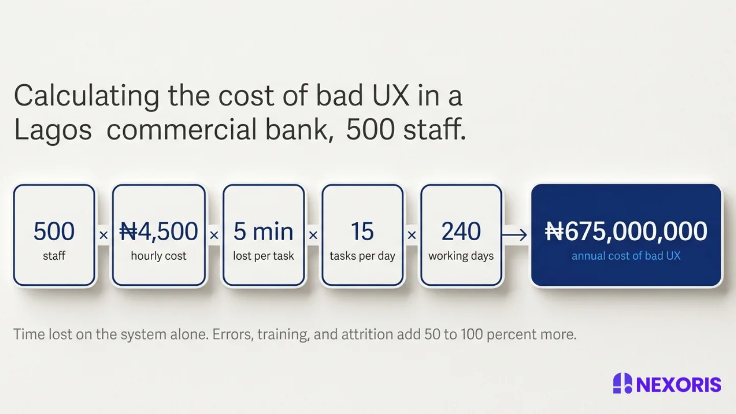
Annual cost of bad UX = (number of staff using the system) × (loaded hourly cost) × (minutes lost per task ÷ 60) × (tasks per day) × (working days per year)
Here are three honest worked examples drawn from real Nexoris Technologies engagements in 2025 and 2026, with names and identifying details changed.
Example 1: A Lagos commercial bank. A customer onboarding system used by 500 staff, where each onboarding task lost roughly 5 minutes to confusing screens, repeated clicks, and error correction. Loaded cost per employee hour: ₦4,500. Tasks per day per employee: 15. Working days per year: 240.
500 × 15 = 7,500 tasks per day. 7,500 × 5 minutes = 37,500 minutes per day = 625 hours per day lost. 625 × ₦4,500 = ₦2,812,500 per day. ₦2,812,500 × 240 = ₦675 million per year.
Example 2: A Nigerian manufacturer. An ERP module used by 80 operations staff. 3 minutes lost per task to navigation friction. ₦3,500 hourly cost. 20 tasks per day. 240 working days. 80 × 20 × (3 ÷ 60) × ₦3,500 × 240 = ₦67.2 million per year.
Example 3: A federal government agency. An internal request system used by 50 staff, with 2 minutes lost per task. ₦2,500 hourly cost. 12 tasks per day. 220 working days. 50 × 12 × (2 ÷ 60) × ₦2,500 × 220 = ₦11 million per year.
These figures only count time lost on the system itself. They do not include the cost of errors that have to be corrected later, the support tickets the system generates, the longer training cycles for new hires, or the attrition cost when frustrated staff leave. Add those back and the real number is typically 1.5 to 2 times higher.
Want this calculated for your specific system?Request a UX audit and we will produce a written cost analysis within 10 business days.
What are the four operational costs of poor enterprise UX?
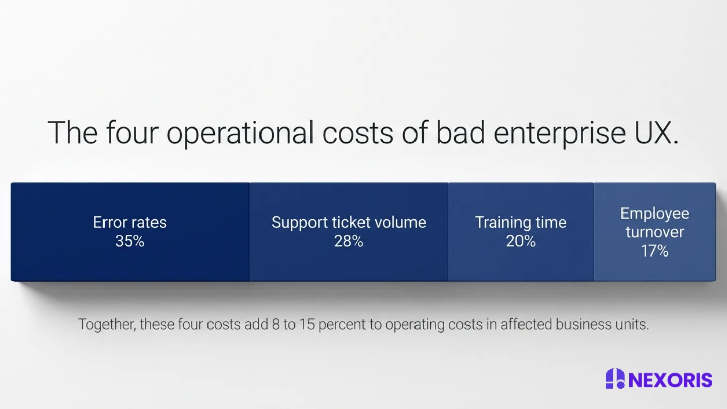
Poor enterprise UX shows up as four costs: error rates, support ticket volume, training time, and employee turnover. Across the UX audits Nexoris Technologies ran in 2024 and 2025, these four together added 8 to 15 percent to operating costs in the business units affected.
1. Error rates
When systems make users carry information in their head, scan crowded screens, or guess at the meaning of unclear labels, mistakes go up. In financial services and healthcare, those mistakes have a direct cost: failed transactions, regulatory incidents, or in the Citi case above, a $900 million wire error. Even in lower-stakes environments, every error has to be detected, escalated, and corrected, often by people who did not make it.
2. Support ticket volume
Bad UX generates support load. Atico³'s 2026 benchmarks across SaaS clients show 20 to 40 percent fewer support tickets within three months of a proper redesign. In the Nigerian enterprise audits we ran in 2025, the median figure was a 28 percent reduction after the highest-impact UX fixes shipped. At an average internal support cost of ₦8,000 to ₦15,000 per ticket once you factor in the time of both the requester and the support agent, this adds up fast.
3. Training time
Hard-to-use systems push the cost of teaching users onto the calendar. New hires take weeks longer to become productive. Existing staff need refresher training every time a feature is added because the underlying interface assumes the user remembers things they should not have to remember.
The cost is not just the training spend. It is the productivity gap between when someone starts and when they actually start contributing.
4. Employee turnover
Frustration with tools is rarely cited explicitly in exit interviews. People frame it as "the role" or "the workload" or "the manager." But in the operations, customer service, and back-office roles where people use the same internal system every day, friction with tools is one of the strongest predictors of attrition we see.
Replacing a Nigerian operations staff member typically costs ₦1.5 million to ₦4 million when you add hiring, onboarding, and lost productivity. Across a team of 50, even a 4-point increase in attrition is ₦3 million to ₦8 million a year, attributable to a tool nobody is willing to call out.
Why is information overload the most common UX failure in enterprise systems?
Information overload is the most common UX failure in enterprise systems because the systems are usually built to show every data point and control on a single screen, which forces the user's brain to filter signal from noise on every action. Designers and product managers see this as completeness. Users experience it as friction.
The pattern is consistent across the audits we run. A dashboard tries to show 14 metrics. A form has 38 fields, of which 9 are actually required for the task at hand. A list view shows 22 columns, of which the user needs 3. Every visit to the screen costs the user a small amount of attention to find what they need, and that small amount, multiplied by every visit, every day, every employee, becomes the bill.
Cognitive load science is settled on this. The more inputs the brain has to process to make a single decision, the slower and less accurate the decision. In tools used throughout the workday, this is not just slow. It is exhausting. By the third hour, employees are making more mistakes, taking longer breaks, and starting to avoid the tasks the system makes hardest.
Productivity drops, not because the team is less capable, but because the system is asking them to think too hard about things that should be automatic.
The fix is rarely visual. It is structural. Hide what is not needed. Surface what is. Order tasks by frequency, not by alphabetical accident. Group related actions. Replace dense tables with focused views. The result is usually a system that looks emptier and works better.
How does bad UX affect employee retention in Nigerian enterprises?
Bad UX is one of the strongest predictors of attrition in roles where employees use the same internal system all day, across Nigerian banks, manufacturers, BPOs, and government agencies. People rarely call it out by name in exit interviews, because it does not feel like a "real" reason to quit. They frame it as the role, the manager, the pay, or the commute. But the system is doing real damage underneath.
Across the operations and customer service teams Nexoris Technologies has worked with, the pattern is consistent. Tenures are shorter on teams using harder tools. Engagement scores in the affected teams sit 15 to 25 points below similar teams using better tools at the same company. New hires either adapt within 90 days or start looking for another job, and the ones who adapt are not the ones with the highest potential. They are the ones with the highest tolerance for friction.
The good news is that this is one of the easiest UX wins to measure. Pick a single team using a single system. Track engagement, attrition, and time-to-productivity for one quarter. Ship a focused round of UX fixes targeting the three highest-friction tasks for that team. Track the same metrics for the next two quarters. The improvement is usually visible by month two and undeniable by month six.
How do we measure good enterprise UX?
Good enterprise UX is measured against three things: adoption, efficiency, and sustainability. These are the metrics that actually predict whether a system is helping the business or quietly costing it.
Adoption is whether the people the system was built for actually use it for the work it was built for. Low adoption almost always points to a UX problem, even when leadership blames "change resistance." If staff are still using spreadsheets on the side, exporting data to do real work elsewhere, or routing around the system through email, the system has lost. Track adoption as the percentage of target tasks completed inside the system, not just login counts.
Efficiency is how fast and how accurately tasks get done. The cleanest measure is task completion time, baselined before and after any UX change. The second-cleanest is error rate, measured by frequency of corrections, escalations, or rejected submissions. If task time goes down and error rate goes down, the UX work is paying for itself. If only one improves, the change probably moved the problem rather than fixed it.
Sustainability is whether the cost of using the system stays low or rises over time. Sustainable UX shows up as low support ticket volume, low refresher-training requirements, and stable engagement scores in the teams using it. Unsustainable UX shows up as systems that "worked at launch" but degrade over six months as features are added, edge cases pile up, and the mental model the original design relied on breaks down.
Together, these three numbers tell you whether your enterprise UX is making the business stronger or weaker. They also give you something to put in a board paper that finance can argue about, which is more than "the new design looks cleaner."
What does a UX audit of an enterprise system actually deliver?
A UX audit of an enterprise system delivers a written report identifying where users lose time, where errors happen, why each problem exists, and what to fix first. A good audit also gives you the cost of each problem in naira so leadership can prioritise based on financial impact, not opinion.
A typical Nexoris Technologies audit takes 10 to 20 business days and covers four things:
Observation: We sit with real users doing real tasks. Not a workshop, not a survey, the actual work. This is where the real friction shows up.
Quantification: We measure task completion time, error rate, support ticket categories, and adoption rate against the system's design intent. The goal is to put a naira figure on each major friction point.
Diagnosis: We separate the problems into three buckets: information architecture (what the screen is trying to do), interaction design (how the user does it), and visual hierarchy (what stands out and what gets lost). Most enterprise UX failures are information architecture problems wearing a visual design disguise.
Recommendation: We deliver a prioritised list of fixes ordered by financial impact and implementation cost, not by what is most fun to redesign. The best audits we deliver name the three changes that recover the largest share of the cost in the shortest time, so leadership can ship quickly.
The deliverable is a written report, a workshop with the leadership team to walk through it, and a clear plan for what to ship in the next 90 days.
How do we calculate the cost of bad UX in our own systems?
You calculate the cost of bad UX in your own systems by measuring five inputs and multiplying them. The inputs are simple, the result is usually shocking, and the maths is the same whether you run a 30-person team or a 5,000-person bank.
Step 1: Count the staff who use the system. Be honest. Include everyone who touches it for any task, not just power users.
Step 2: Work out the loaded hourly cost per employee. Loaded cost means salary plus benefits plus overhead, divided by working hours. For most Nigerian roles, this lands somewhere between ₦2,000 and ₦8,000 per hour. If you do not know the figure for your team, use ₦4,000 as a starting estimate and refine later.
Step 3: Estimate the time lost per task to friction. Sit with three or four users doing the same task and time them. Subtract the time the task should take from the time it actually takes. The difference is friction. For most enterprise systems with known UX problems, the figure is 2 to 8 minutes per task.
Step 4: Estimate the number of tasks per day per user. This is the realistic number, not the theoretical one. Most operations and back-office roles do 10 to 30 transaction tasks a day on a single core system.
Step 5: Multiply, then multiply by working days. Most Nigerian enterprises run 220 to 240 working days a year.
The output is your annual cost of bad UX in naira. It is not theoretical. It is the bill the business is already paying, just spread across so many line items that nobody is calling it out.
How Nexoris Technologies helps
Nexoris Technologies is a Lagos-based technology company that builds and manages digital products for businesses across Nigeria, Africa, and globally. We work with banks, manufacturers, e-commerce brands, and government institutions whose internal systems are quietly costing them more than the original software ever did.
Our enterprise UX work covers three things: written audits of existing systems with naira-quantified cost analysis, focused redesign sprints targeting the three to five highest-cost friction points, and AI-assisted internal tools that adapt to user roles and behaviour to reduce cognitive load over time. Every engagement includes a clear scope, a defined timeline, and full ownership of the deliverables transferred to the client at handover.
If your team is fighting an internal system every day, the cost is already on your books. The question is whether you find the number before your finance team does.
The figures in this guide come from Nexoris Technologies' internal data on enterprise UX audits and redesigns conducted between May 2025 and April 2026, the public Forrester Total Economic Impact study commissioned by UserTesting (August 2025), Pendo's 2025 software experience research, IBM's 2024 and 2025 enterprise IT cost benchmarks, Atico³'s 2026 SaaS UX ROI benchmarks, and Baymard Institute's ongoing UX research.
External case figures (Citi, Sonos, British Airways, the "Continue" button case) are drawn from public reporting and verified before publication. We update this guide every quarter as new research is published and new client engagements close.
Sources and references
Pendo, "The hidden cost of bad software," 2025
Forrester Consulting, "The Total Economic Impact™ Of UserTesting," commissioned study, August 2025
IBM, enterprise IT cost and digital experience benchmarks, 2024 and 2025
Atico³, "The ROI of Hiring a UX Agency: Real Numbers, Not Theory," April 2026
Baymard Institute, ongoing UX research statistics
Maze, "30+ Essential UX Stats for 2026 Strategy"
UX Planet, the 1-10-100 rule of design defect cost
Public reporting on the Citi v Revlon wire error (US District Court, Southern District of New York, 2020)
Public reporting on the Sonos app redesign and CEO transition (2024)
Public reporting on the British Airways GDPR enforcement action (Information Commissioner's Office, 2020)
Jared Spool, "The $300 Million Button" case study Nexoris Technologies internal audit and redesign data, May 2025 to April 2026
Share this article
Common questions
How much money do Nigerian companies lose to bad enterprise software design? +
Nigerian organizations typically lose between 8 and 15 percent of their operating expenses in departments that rely on poorly designed systems. For a 500-staff enterprise, this can translate to an annual cost ranging from ₦200 million to over ₦600 million.
What are the primary operational areas where poor design creates hidden costs? +
Nexoris Technologies identifies four predictable areas where these costs appear: increased error rates, high volumes of support tickets, longer training times for staff, and higher employee turnover.
Why is it important to fix design flaws before launching a system? +
Fixing design flaws early is significantly cheaper than addressing them after a launch. According to the 1-10-100 rule, it is 100 times more expensive to correct UX issues once a system is already in use compared to addressing them during the design phase.
How can a business calculate the financial impact of inefficient digital tools? +
You can estimate the cost by multiplying the number of staff using the system by their loaded hourly cost, the minutes lost per task, the number of tasks performed daily, and the total working days per year. Nexoris Technologies also offers professional UX audits to provide a detailed, written cost analysis for specific systems.
Why do leadership teams often fail to notice the costs associated with bad UX? +
These costs are often invisible because they are spread across different departments. Finance sees high training costs, Operations sees rising support tickets, and HR sees staff turnover. Because these expenses are reported as separate line items, leadership often fails to connect them to the underlying issue of a difficult-to-use digital system.
What is the difference between measuring UX in consumer software versus enterprise software? +
In consumer software, UX is often judged by brand feel and visual appeal. In enterprise software, the standard is based on outcomes: how quickly employees complete tasks, the frequency of errors, the volume of support required, and how fast new hires reach full productivity.
Written by
Chinedu Nwogu
Chinedu Nwogu is the Founder and CEO of Nexoris Technologies with 7 years of expertise in SEO, GEO, and AEO, as well as software and digital products. His work at Nexoris Technologies involves conducting enterprise UX audits that identify how poor digital design inflates operating expenses through increased error rates, support tickets, and staff turnover.
Chinedu Nwogu is a fact-checker with 7 years of experience as the Founder and CEO of Nexoris Technologies, specializing in SEO, GEO, AEO, software, and digital products. His work at Nexoris Technologies involves conducting enterprise UX audits that identify how design flaws contribute to high error rates and increased operating costs.
Use this guide to calculate your project budget and verify quotes from developers. It includes a breakdown of yearly maintenance costs, which Nexoris Technologies estimates at 15 to 25 percent of your initial build price.
Use this breakdown to estimate your budget based on project complexity, ranging from ₦1.8 million for simple tools to over ₦65 million for enterprise systems.





 Chinedu Nwogu